Aligned Adventure Rebrand
Overview:
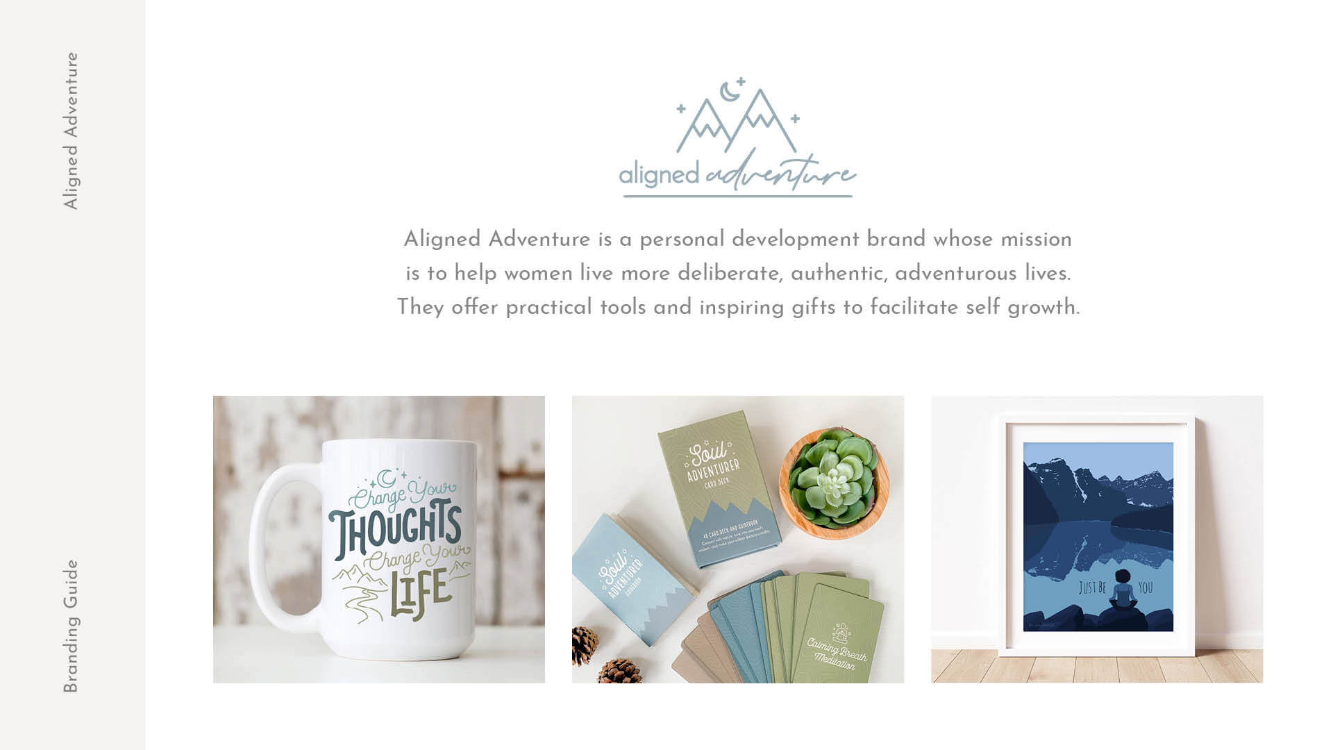
Aligned Adventure started as an Etsy shop in 2014. For the first few years, I sold personalized outdoor adventure themed gifts and art. The shop was extremely successful, generating six figures of revenue multiple years in a row.
The Challenge:
After a serious health scare, I felt powerful inspiration to up-level every area of my life. I fell in love with personal development and spirituality, got my transformational coaching certification, and decided I wanted to pivot Aligned Adventure to be more personal growth focused. I started creating new inspirational products and tools that are designed to facilitate self growth.
However, the existing look of the brand didn’t fully portray its new mission. The mountain graphic portion of the logo didn’t capture the transformational power of the products, and the brand colors felt generic.
Skills:
- User Research
- Logo Design
- Brand/Identity Design
Tools:
- Illustrator
- InDesign
- Photoshop
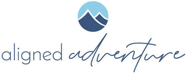
Original Logo
The Process:
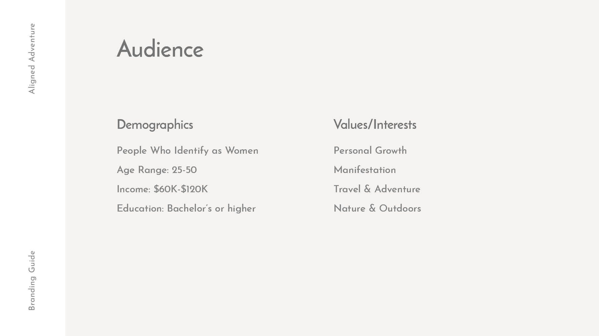
As I pivoted Aligned Adventure, I was concurrently coaching clients to help them create change in their lives and achieve their goals. I learned about their dreams and desires, their challenges and roadblocks; as well as their demographics, values, and interests.
I used this information to not only inform my new product offerings, but also to steer the rebrand process. I shared prototypes with past clients and incorporated some of their feedback.
The Result:
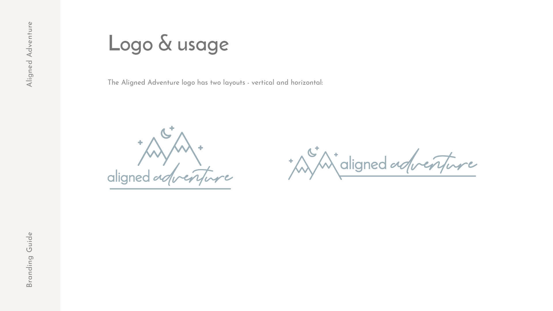
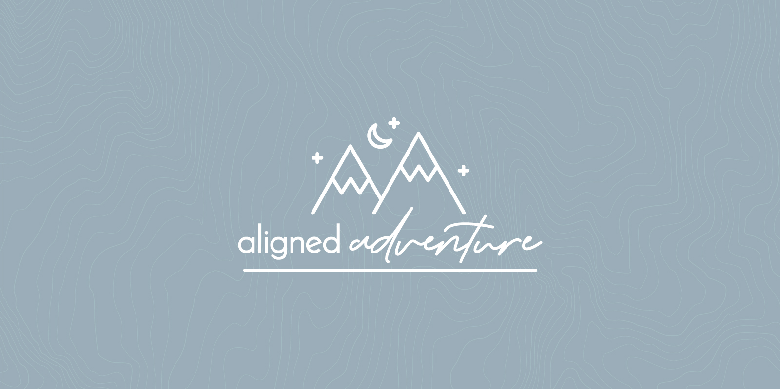
The new Aligned Adventure logo remains true to its adventure-inspired roots. However, it was updated to include night sky elements:
- Moon – which symbolizes change or transformation
- Stars – which suggest a spiritual connection to one’s self and/or the universe. The style of the logo was updated to be more icon-like, appealing to more of a millennial audience.
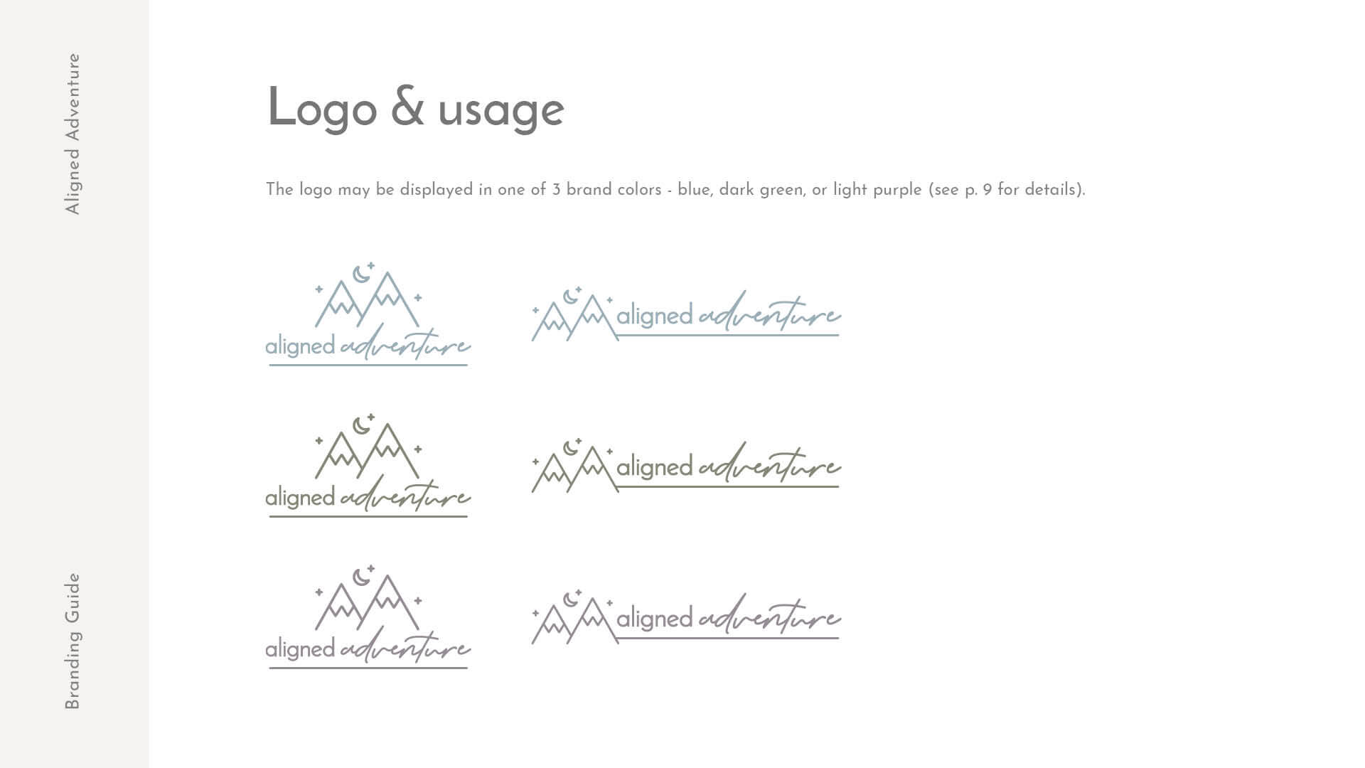
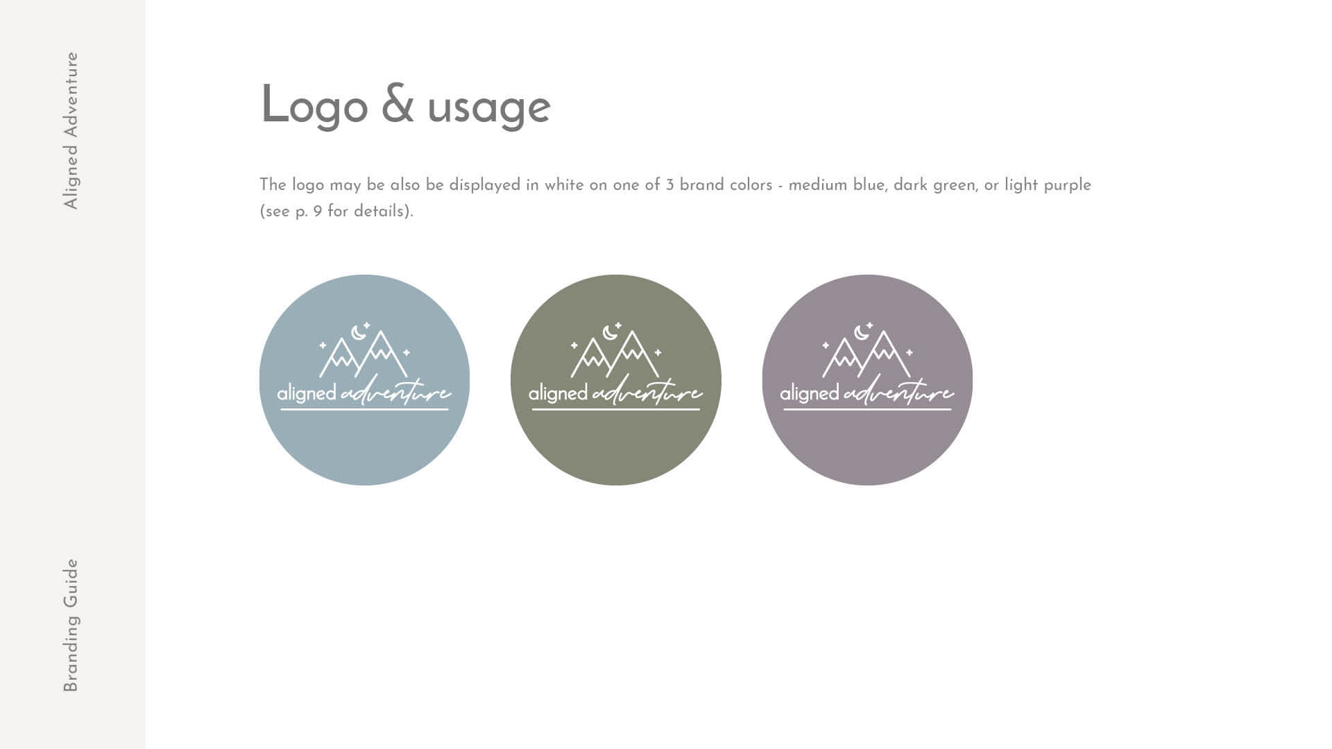
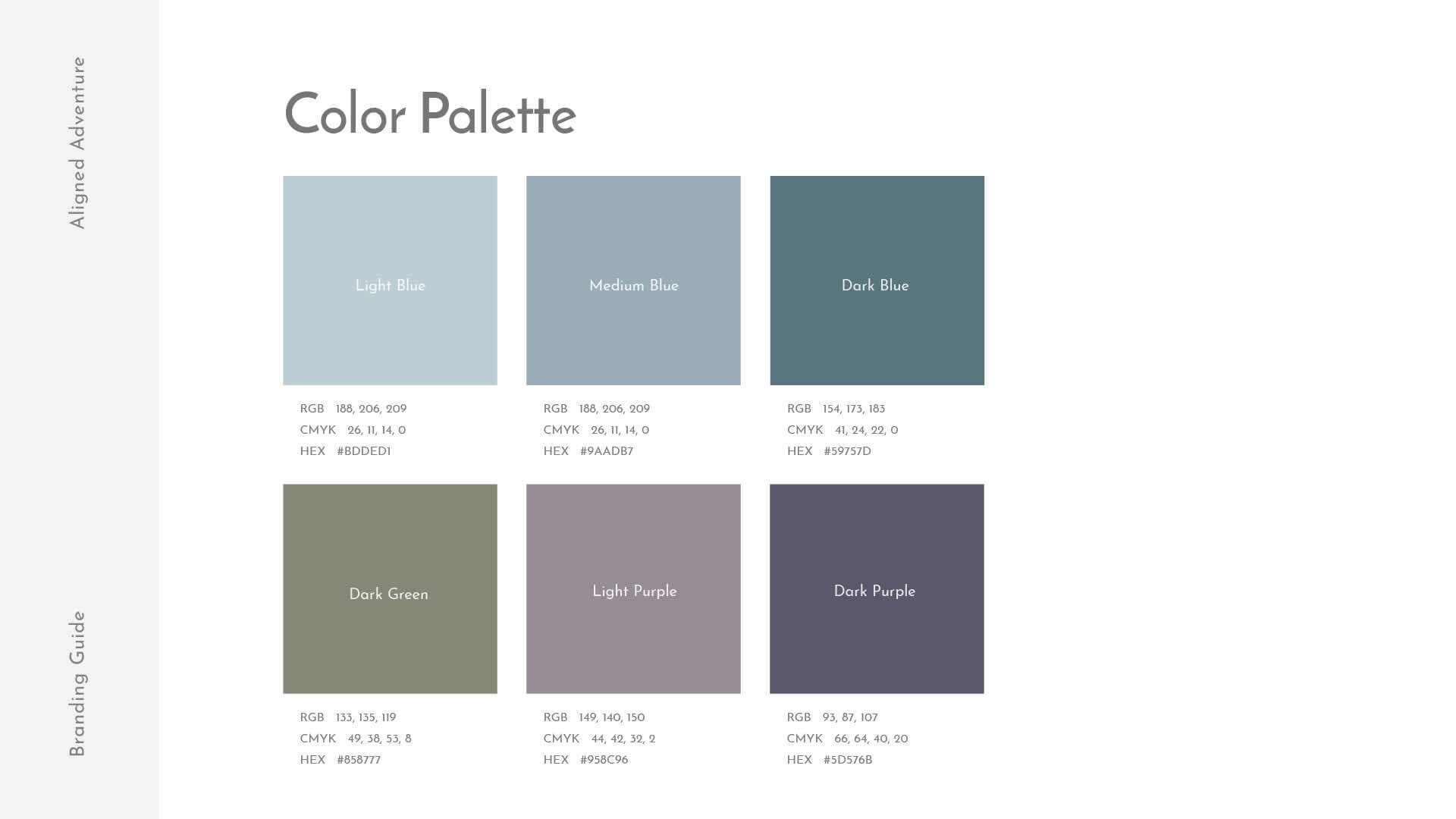
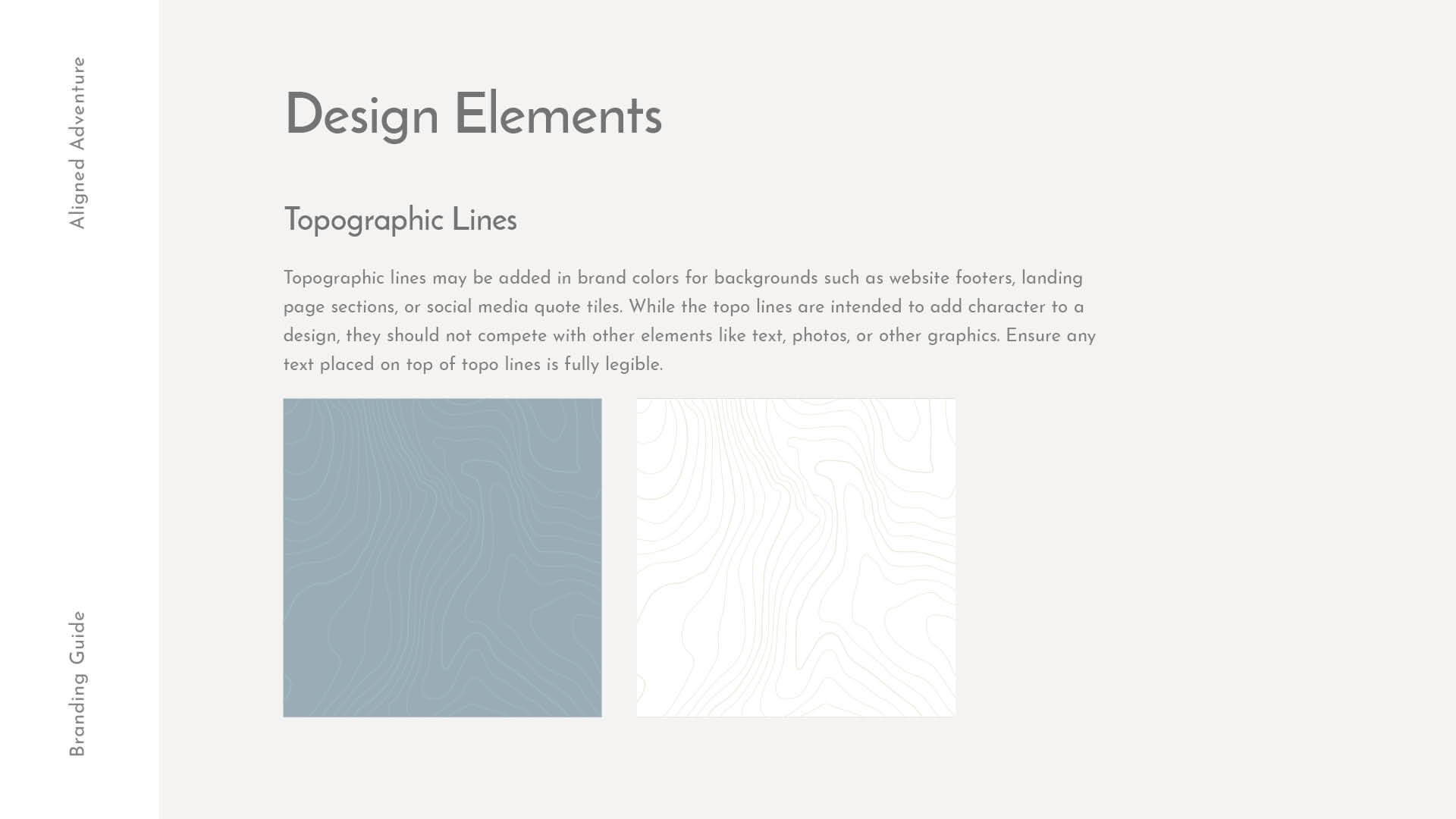
Since 90% of both my coaching clients and e-commerce customers are women, I updated the brand color palette to be more feminine, incorporating a more muted blue, as well as soft greens and purples. I also wanted the brand to reflect the feeling of a journey, so I created design elements like topo lines to incorporate on the website and social media profiles.
